The Beauty of Pinup and Commercial Art

This is a blog about men and women as seen throughout the history of advertising and pinup art. Art has always reflected the distinct diversity and beauty of both sexes respectively. Just as there is a moon, there is a sun, a night and day, cold and hot...male and female. It is the very sustenance of Nature.

Thursday, December 21, 2006

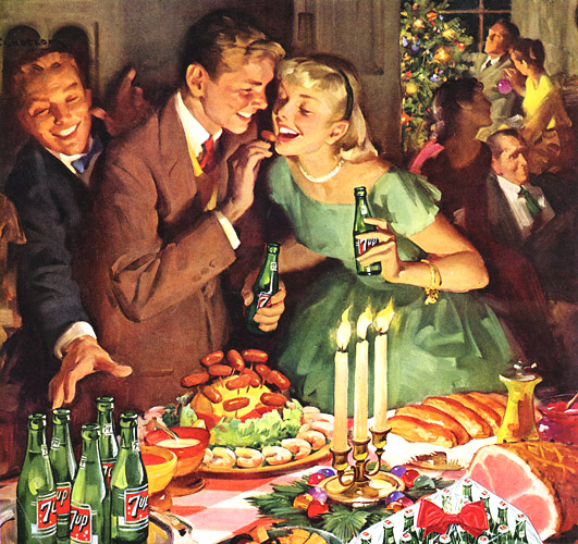
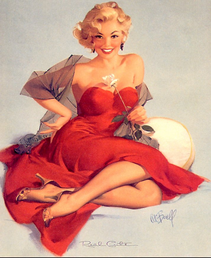
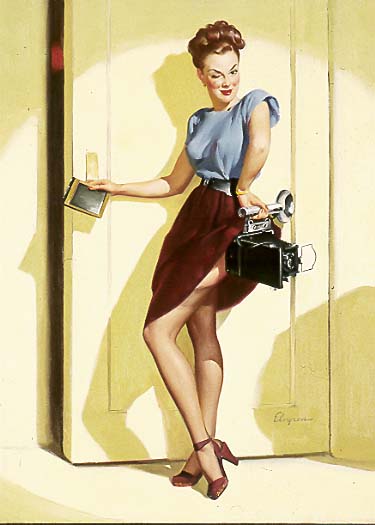
The bus is not the only thing that stops here...


The gorgeous woman depicted above was created by Gil Elvgren. This picture has a lot of dynamic motion and an interesting play with shapes. All this motivated by a simple idea from where Elvgren's inspiration takes off. Most of Elvgren's models have a motivation that give them a reason to be sexy, although apparently they are unaware of this, or are they? The women are your average woman you meet at an office, a post office station or a...bus stop. The picture above shows us a young woman traveling, who has encountered some difficulties along the way: little rocks inside her high heels. Ouch! Obviously, she stops to remove these, and here is where Elvgren takes advantage to show us her alluring beauty and feminine sensuality. The positioning of her body only adds to accentuate her curves to remind us of her femaleness. She seems delicate, in need of help. What man could refuse to help this damsel in distress?

She takes of her shoe on her left foot to remove the rocks hurting her. To achieve this, she balances her body by pressing her left hand on the bus sign, then lifts her left leg to remove the shoe. This forces her body forward making her bust more prominent while pushing her bottom out more the opposite direction, completing the circular rounded features of her body. Also, to remove the shoe on her left leg, she has to cross it over the right in order to reach. This is the key, most important action in the entire picture because it accidentally reveals the black stockings on her legs and a glimpse of her inner thighs, making the picture sexy.

One aspect that strikes me about this Elvgren picture is the curious play on shapes. On the model's right is her rectangular luggage, and on her left a rounded bag for her hats. In the middle is her, and by crossing her leg she creates a triangle above the two other shapes. She rests her left hand on a rectangular shape as well. These shapes give the picture a sense of proportion. On an open field, it's hard to tell how tall or short is the model, but by placing her next to her luggage and a sign post, we get an idea of her size.

The use of the color white for her skirt, serves to contrast and make her black stockings seem more prominent, thus making her sexier. The blue sky behind her makes the reddish tone of her hair richer, bringing our attention to her eyes and a face that says, "Oops".

Monday, December 18, 2006

Get (7)UP and Celebrate!


The ad above is from 1957 for the 7 UP soft drink. It is a very festive, cheerful, vibrant picture expressing the joys of celebrating Christmas. The busy frame gives us the impression of a crowded gathering of friends, with people talking, laughing and excited to be with each other. There is a low light which adds to that special warmth of the holidays. And of course, everyone is drinking 7 UP which obviously brings such good friends together.

At the center of the picture, there is a couple, also holding 7 UP drinks in their hands, playfully flirting with one another. The man teases what is probably his girlfriend, with a small sausage which she is about to bite. The sexual tension between the two builds. Her right arm seems to be holding him. They're in their own world. The man to the left is too busy trying to grab a 7 UP to even noticed the couple.

Interestingly, together the couple form a triangle, like a Christmas tree. In the middle of them, there is a smaller triangle form created by the man's hand offering the sausage, and her arm holding him. Triangular compositions give the picture more balance and stability.

In the background there is a couple decorating the Christmas tree. In this interaction, the female is the one holding an ornament to give to the man, in contrast to the man feeding his girlfriend with a sausage in the foreground. The man fixing the tree in the background seems older than the man in the foreground, and there is no suggestion of any flirtatious behavior between him and the woman holding the violet colored ornament.

Those who clearly stand out in this picture are the two couples in the front and background. The other three characters sort of blend with the picture in light and color shade as just part of the party crowd.

One last interesting detail is the man to the left of the foreground couple. While he tries grabbing a 7 UP, his left hand makes an interesting sign. I look at his left hand and ask, why is his hand depicted this way? If you look closely at the thumb and index finger they form a number 7. Clever advertising.

Thursday, December 14, 2006

And the past becomes the present...


The ad above is from 1951, for Maxwell House coffee. It brings us memories from the distant past of our ancestors, when the women stayed behind preparing the food, stoking the fires while the man diligently when out to find the means of survival. Here we see the man approaching the camp with more wood for the fire, as the woman signals it's time for (Maxwell House) coffee.

A lot of warmth radiates from this woman. This is emphasized by her red shirt which glows redder from the light of the fire below. This reddish hue brings out a warmer flesh tone. On her right hand she holds the coffee pot and with her left she signals her man that coffee is ready. Both the pot and the cup are white, the same color as her pants. One can take this as meaning that giving and caring, symbolized by the pot and cup comes natural to this woman. The color white connects her nurturing attitude with the objects, serving as an extension of her nature.

From the approaching man's view, she sees a beautiful woman, glowing by the fire, holding a coffee pot on one hand and an empty cup on the other. That cup is for him, and he's looking forward to it after working hard, cutting and gathering wood for their fire. How reassuring to come back to the comforts of a woman who cares so much for you. She has the coffee ready and plates nearby which will soon be filled with the food being cooked.

The fire itself symbolizes their union, their passion and love for each other. Already the sun is coming down, and soon it will only be the fire providing light and warmth to the couple. The warmth that may lead to a more passionate intimacy as the night falls.

Monday, December 11, 2006

Composed and Comfortable


Donald Rust is the artist behind the artwork above. Being born in 1932, he wasn't part of the great pinup era, but was very influenced by his own grandfather, Emil Rust, Gil Elvgren and Norman Rockwell, among others.

The picture above is dynamic and reassuring. The model strikes a confident and comfortable pose. The triangular composition created by her hands on her head, parallel to her right leg crossing horizontally her vertical left leg, serve to create a sense of balance and stability while at the same time creating a sense of dynamic movement. In this pose, her feminine curves are accentuated. Her light blue robe serves as a buffer zone between the stark white background and the black teddy she's wearing. Her bust becomes more prominent thanks to the contrast created by the white background which makes her black teddy more visible.

If you observe closely, there is a tense dynamic created by the opposite directions of the face and bust. Her bust line flows from the upper left down the bottom right, while her face creates an opposite line, from lower left to upper right. This makes her look more curvaceous and invitingly seductive and gives the painting a sense of movement and balance.

Saturday, December 09, 2006

Decisions...decisions


The World War II picture is once again, from Al Buell. Since he was not allowed to go and fight the Axis, he contributed with the war effort by painting a series of pinups supporting our mission. At the time, women were asked to participate in the armed forces as well. While women were not allowed into combat missions, they did provide much needed logistical support.

As seen above, an ordinary young woman has many choices she can make. While contemplating her decision, she holds a set of keys under her left wrist. Keys symbolize destiny: Her destiny is in her hands. She wears a navy blue skirt, very reminiscent of those worn by servicewomen at the time, meaning her mind is already half made up to join one of the services, but which would it be?

No doubt, this picture was designed with young women in mind. For men, more rugged and rough images would be used to appeal to their sense of masculinity, and stir them into wanting to fight. Buell's style in this picture, while sober, still manages to add a soft touch by posing his model in such a playful manner. Her attitude creates a contrast with the reality of what joining those services actually means. Although, she's contemplating joining one of the services, it doesn't appear as if she takes it too seriously.

Thursday, December 07, 2006

Real Cute


Al Buell was the master who created the illustration above, appropriately titled, Real Cute. A mostly self-taught artist from Kansas, Al did many Coca-Cola ads. Rejected by the draft during World War II, he created many patriotic pinups which became popular. Al also contributed to the Gallery of Glamour for Esquire Magazine in 1946. In 1965 he retired from his commercial career and dedicated his art to landscapes and portraits until 1993 when he suffered an accident. Sadly, he died in a nursing home in 1996.

Although there is only one subject on this picture, a female, there is plenty of movement and energy dictated from the upper left side going down to the lower right, by the model's right knee. The way she keeps her right arm, with her elbow sticking out creates a triangle, while her sitting position, with legs curled in, create an opposite triangle. On these two "triangles" rest the balance of this beautiful picture. It also emphasizes her femininity by accentuating her curves. On the top middle section of the picture we see a happy, smiling radiant woman full of self-confidence. She's proud of herself and how she looks, and knows how to make the best of it. Conveniently holding a white flower on her left hand, brings our attention to her well-rounded breasts. She wants us to notice and look at her, yet she does so with a bit of mischief and class.

Finally, the red colored dress brings out a healthier, rosier looking skin tone which makes her more attractive. It brings warmth and passion. As a guy I want to just lift her into my arms. This is the kind of emotion I think Al was trying to create and I believe he succeeds.

Tuesday, December 05, 2006

Oh, take me away...


The ad above is from 1955 for Jantzen swimwear. Here we see a beautiful, latin looking brunette with very cute, feminine curves, accentuated by a frilly swimsuit full of flowery designs. She's ecstatic, revelling in her power to attract the opposite sex. We don't see his face, because it's not really necessary for the effects of the ad, but we do see the hands of a man on the upper right corner. He's grabbing her by the wrists, taking her away. This is the effect she has on him, she knows it and is satisfied to exude such feminine power that stirs him to the core of his masculine self.

Sunday, December 03, 2006

Oh boy! It sure's hot in here!


The illustration above is once again by Gil Elvgren. Here the model has a perfect excuse to show off her charms; it's very hot in here! Hmmm...I wonder why. Elvgren uses a rich yellow color around the model to give us that feeling of summer hazy heat. As a matter of fact, it's so hot that just having a fan swirl air around is not enough; she has to put a big block of ice in front of it (I've never tried it, but it looks ingenious)to cool that gorgeous, feminine body. Her facial expression and smile are telling us, "I would never sit around like this you know, but what's a girl to do when it's so hot?"

As you can observe, Elvgren does not use many props. There is only a rattan cane chair, a fan and a block of ice that cannot compete with the alluring beauty of the model. In this way, the model remains as the main centerpiece in the illustration.

I think it's interesting that at the time of this illustration, it was common for women to dress in this fashion under their clothes. Pantyhose did not exist until Glen Raven Mills introduced it in 1959. Yet, today this looks like a depiction of a Playboy model. For Elvgren though, it was just an ordinary woman with wit and cheek.

During the 1970's, women's groups fought for equality with men at all levels. It was taken a radical step further and suddenly feminine qualities as illustrated above became outdated, oppressive and chauvinistic. However, as more women entered professions and even positions of power, they have wanted to gained back that sense of seductive femininity we see above. Thus, the success of fashion houses like Victoria's Secret, Frederick's of Hollywood and others.

Just last week, I was watching an episode from Dr. 90210 on the E! Channel. It featured a woman body-builder who actively competed for women's body building titles. Her boyfriend was her trainer and pushed her to be her best. However, despite success in this field, she confesses feeling that something was missing from her life.

Pushed by her boyfriend to do better, she worked very hard at the gym with heavy weights and different exercise routines. In time, this burnt out all the fatty tissue around the breast area. She felt she needed a lift, both physically and emotionally, thus visited a plastic surgeon to get breast implants. Her only worry was not being able to get back to the gym in time for competitions, after the operation. Despite the worry, she went ahead with the surgical procedure and was very satisfied with the results. Her self-confidence increased and she claimed to feel "sexy and feminine" again. Despite the titles won and having a successful career building muscle, which is a traditionally male fitness activity, she wanted to look at herself in the mirror and see a real woman behind all those muscles.

I think this illustrates, that no matter what job a woman does, or how she looks in the outside, inside she wants to feel like the picture above. It's a timeless feeling that no social, religious or political movement can erase.

Saturday, December 02, 2006

Looking at Mr. Right


The ad above is from 1948 for the Hart Schaffner & Marx men's clothing company. HSM was officially established in 1887 by the Hart brothers and their cousin Joseph Schaffner. They were the first to create an ad campaign for men's clothing. HSM has always been on the forefront of new changes. In 1936 it introduced the zipper in men's pants, and in 1953 it introduced the first Dacron polyester wool suit.

Looking at the ad above, one observes the mounting tension between the three women inside the train looking out the window at the man dressed with the HSM clothes. The brunette smiles nervously, while keeping an eye on the man. She is commenting to her blond friend, who in turn looks at the man with interest. What is so interesting about him for the women? If you observe the man, he stands straight up with confidence, wearing a brown coat. Brown is a color that signifies strength, reliability and security, which are traits women look for in men.

In 1948, many women kept American industry vibrant and alive by working in the factories while the men returned from the aftermath of World War II. During the 1940's the American woman became more independent. Yet, as the ad demonstrates, despite finding this new inner strength, she still looked for these same traits in her man. The ad which was created for men suggests that in order to essentially be a man, you have to wear HSM clothes. Advertising aside, the important factor here is the emphasis on masculine qualities which still seem as prevalent today as they were in 1948. Just yesterday, BBC news reported that according to a survey by The Skipton Building Society, women in the UK resented their male partners or husbands who earned less than they. The earning imbalance created arguments and separations. The women lose respect for the man because they no longer see him as self-confident or reliable enough. It's not that they need to depend on him, but they do need to see his natural traits flourish rather than dampen. The man in the HSM ad clearly has all these characteristics and that's why he is so attractive for the women in the train.

Friday, December 01, 2006

More than meets the eye


The picture above is by Gil Elvgren, one of America's principle illustrator and pinup artist from the 1940's, 50's and beyond. Elvgren is respected for his color technique and use of rich brushstrokes. The "Elvgren Girl" comes alive in a way that has become very popular with pinup art collectors today. Elvgren succeeded in combining a certain sweet innocence with a bit of feminine temptation. He always casted his models in a positive, entertaining way. In his illustrations we see the power of feminine beauty in rich color combinations. His models express their sexiness with a strong self-confidence, with class and without being vulgar, much less obscene.

The illustration above shows a professional woman, most likely a photojournalist. She is ready to go on assignment, excited and fearless. Given the time period, since she is working, most likely she is unmarried and independent. However, despite all this power, she doesn't forget her strongest one: the power to seduce. As she carefully lifts up her skirt with the camera, making it look accidental, she is seducing us with her beauty and femininity. In this scenario, the male is challenged on two fronts, both professional and personal. How does he react?